
I was curious about a dataset on smartphone addiction—not just how much people use their phones, but how that use shows up in daily life.
The dataset is called “Smartphone Usage and Addiction Analysis.” It contains usage and addiction indicators from 7,500 individuals. (I have no way to verify how it was collected but for our purposes, this is not the point.)
Addiction signals in the dataset include: screen exposure, app usage patterns, checking frequency, time spent on social platforms, and indicators tied to sleep and productivity. The dataset also contains background attributes that made it possible to compare usage across different types of people.
To explore it properly, I leaned on the Analyst agent in Microsoft Copilot. Each plays a distinct role, and understanding that division is what turns raw data into insight.
How the Analyst Agent Helps
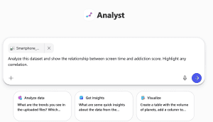
The prompt I used was intentionally simple and open-ended:
“Analyze the relationship between daily screen time and addiction score and visualize the pattern.”
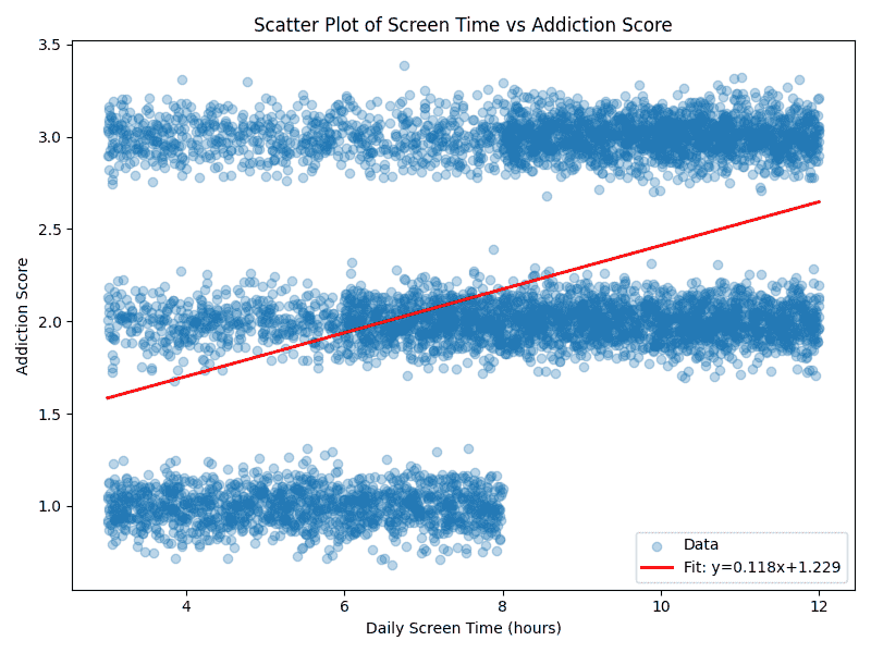
Analyst immediately reframed the analysis. Instead of focusing on rows and formulas, it surfaced patterns, relationships, and visual explanations. It generated a scatterplot with a trend line that made the story clear at a glance.
What Copilot Analyst Is Best At
Analyst is especially strong at answering questions like:
- What patterns stand out across the full dataset?
- How do two variables relate visually and conceptually?
- Is there a trend worth paying attention to?
- How can I explain this to a non-technical audience?
- What story do the visuals tell?
This is where Analyst differentiates itself. It doesn’t just show you data—it helps you reason about it. It helps you tell the story! As a storyteller, I love that part. All of your separate Excel cells suddenly feel compelling because they reveal the plot! And speaking of plot…
What the Scatterplot Reveals
The scatterplot told a truly compelling story without requiring much explanation. As daily screen exposure increased, points clustered higher along the addiction scale. The upward‑sloping trend line reinforces that people who spend more time on their phones tend to show stronger addiction signals.
The visualization makes it obvious that the relationship isn’t random or anecdotal. It’s consistent, visible, and meaningful, even if not perfectly predictive.
This is where Analyst stands out: turning statistical output into something intuitive.
Why the Dataset Works So Well for This
What makes this dataset especially valuable is its breadth. It doesn’t focus on a single metric, but instead paints a structured picture of smartphone behavior—how often people check their devices, how their time is distributed, and how usage overlaps with sleep, productivity, and daily routines. That makes it ideal for exploring modern questions about attention, habits, and digital well-being.
For students, researchers, and analysts, it’s the kind of data that invites both quantitative analysis and qualitative interpretation—which is exactly why using Excel and Analyst together makes so much sense. You can explore and download datasets for free at kaggle.com.
Why I Didn’t Use Excel
In this case, I didn’t start in Excel and that was intentional. I already had a well-structured dataset, so I didn’t need to do heavy preparation or formula-driven cleanup. Instead, I wanted to move quickly into understanding patterns and relationships, which made Analyst the better starting point.
What Excel (and Copilot in Excel) Is Best At
- Build or clean a dataset from scratch
- Create formulas, calculations, and derived fields
- Perform precise, cell-level computations
- Validate numbers and ensure accuracy
- Work iteratively with structured tables and pivots
Why Analyst Made More Sense Here
- Skip straight to exploring relationships
- Ask higher-level questions in natural language
- Generate visuals without manual setup
- Focus on interpretation rather than mechanics
- Quickly explain what the data suggests, not just what it contains
The Key Difference
- Excel answers: How do I calculate this correctly?
- Analyst answers: What does this pattern mean, and why should I care?